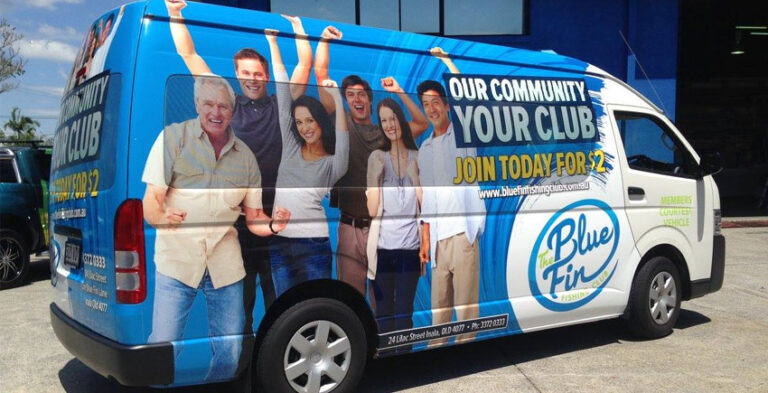
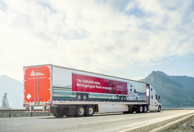
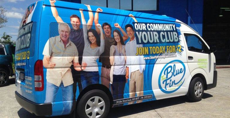
Truck wraps and vinyl lettering are two ways to place a business identity onto commercial vehicles. A wrap can carry larger connected artwork, while lettering focuses on individual logos and words. Neither method is automatically right for every truck. The choice should follow the vehicle’s body construction, message and how it is used.
The examples below focus on choosing suitable layouts, preparing accurate information and making graphics that work on real commercial vehicles. Each vehicle must be assessed for its physical condition, openings and working environment before production.
What a commercial truck wrap means
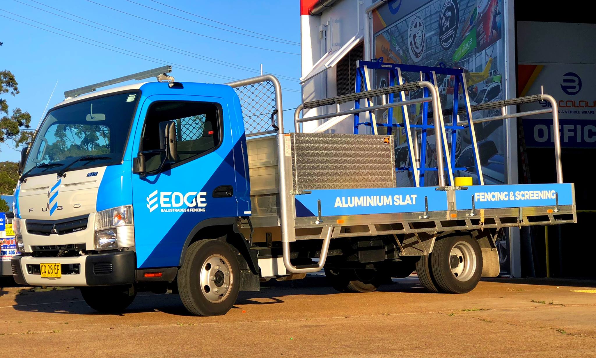
A truck wrap generally uses printed or coloured film across larger vehicle panels. The graphic can include colour blocks, logos, illustrated products or visual patterns. However, many trucks have mixed surfaces, seams and working hardware that complicate continuous coverage. The design must account for the real body and use materials appropriate to the surface. “Wrapping” should not imply that every exposed section is suitable or included.
What cut vinyl lettering does well
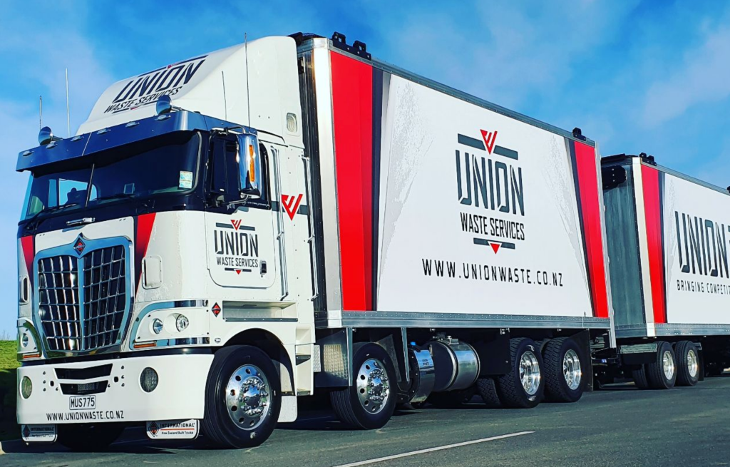
Cut lettering applies individual characters, logos or shapes to suitable areas. It is useful for a readable company name, phone number or short service line. Because it does not require a connected printed background, lettering can integrate with the truck’s original paint colour. Its visual effect depends strongly on contrast and the positioning of each word. Lettering is also useful when operators need a straightforward, consistent identity across different bodies.
The role of panel size and construction
A box truck offers broad panels, while a tipper, pickup truck or articulated vehicle may have irregular usable surfaces. The material and curvature of each panel matter. Before selecting a graphic method, establish whether it will be installed on painted metal, a composite panel or another body surface. Do not assume that film suitable for one surface will automatically be suitable for another.
Compare visual hierarchy rather than area alone
A large printed design is not necessarily more effective if it hides the business name. Lettering can look restrained and confident when placed with generous spacing. A full-panel design can be valuable when the company uses strong imagery or recognisable colour fields. In both cases, place the logo where it remains visible with doors closed and avoid long text on moving sections. Judge the mockup from practical viewing distances.
Mixed designs can work well
Truck branding may combine a printed colour band or photographic panel with individual vinyl letters. This is useful when the brand has a bold visual element but also needs a clear operational message. The different elements should share consistent colour, type and proportions. Ask for an accurate production proof so the printed and cut pieces align across the relevant panels.
Operational and maintenance considerations
Truck graphics need to coexist with loading areas, wash routines, safety markings and frequent movement. Discuss film care and suitable cleaning methods with the installer. Avoid placing important graphics where cargo routinely rubs against bodywork. Keep digital artwork and material details so a replacement section can match the approved design if a panel is repaired.
What to show the designer
Provide a photograph of each side and the rear, accurate body dimensions, a list of obstacles such as hinges and access panels, your logo and the exact text that must appear. Explain whether the truck travels mainly in urban traffic or industrial environments. The designer can then propose a layout that accounts for how the vehicle is actually seen and used.
Practical project preparation checklist
- Vehicle identification: Record the make, model, body style, year and relevant dimensions.
- Photographs: Photograph the left side, right side and rear, including any working equipment.
- Artwork: Supply an approved business logo, correct company name, brand colours and text.
- Viewing conditions: Decide where the vehicle is usually parked and what is visible in normal use.
- Body limitations: Identify doors, hinges, windows, trim, registration details and safety features.
- Proofing: Check artwork placement, contact details, logo readability and how the graphics appear at reduced size.
Frequently asked questions
Are truck wraps and truck lettering the same?
No. Wrapping usually covers larger surfaces with film; lettering applies individual graphics or text.
Can both approaches be combined?
Yes. Printed panels and cut lettering may work together within one design.
Is every truck body suitable for the same film?
No. Body material, surface condition and construction affect installation suitability.
How do I prepare for a truck graphics project?
Gather vehicle details, photographs, panel measurements, logo artwork and clear wording.
Take the next step with a clear vehicle brief
Good branding comes from balancing a strong visual identity with the vehicle’s everyday use. Instead of copying a layout from a different model, provide photographs and discuss the available panels and the main message. A practical design brief gives the project a stronger foundation.
Explore truck branding, related van wrapping and fleet branding, or contact Kayma Signs about your commercial vehicle graphics.
Real-world design scenarios and practical decisions
A simple company-identity application
For a truck that primarily needs identification, cut lettering can provide a clear business name and contact details without large printed artwork. The truck’s paint colour becomes part of the design, so contrast is particularly important. Position the lettering where hinges, door handles and other body fittings will not interrupt the message. A clean door-logo application can be recognisable when repeated across several company trucks.
A graphic-heavy campaign application
A company with distinctive artwork or a product image might choose larger printed panels. The design can use a consistent visual across the side body, but should still keep the logo separate enough to be readable. Complex imagery should not be split awkwardly by access doors or loading hardware. If a truck’s body has unusual surfaces, discuss which parts can be covered safely and what installation method is appropriate.
Combining approaches on one vehicle
An operator may choose a large printed colour field on the side and simpler lettering on the cab doors. This balances broad brand recognition with practical space for contact information. The parts should use compatible colours and approved typography. Ask for a single proof showing both treatments together; reviewing each element separately can miss inconsistencies in scale, colour or placement.
Making the choice based on operations
A truck used for repeated loading has different practical needs from a vehicle that mostly travels between distribution centres. Identify which panels come into contact with cargo, straps, equipment or frequent cleaning. Keep important graphics away from surfaces likely to be worn or obscured. Review how the truck appears during normal use rather than selecting a method from photographs of unrelated vehicles.