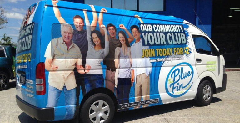
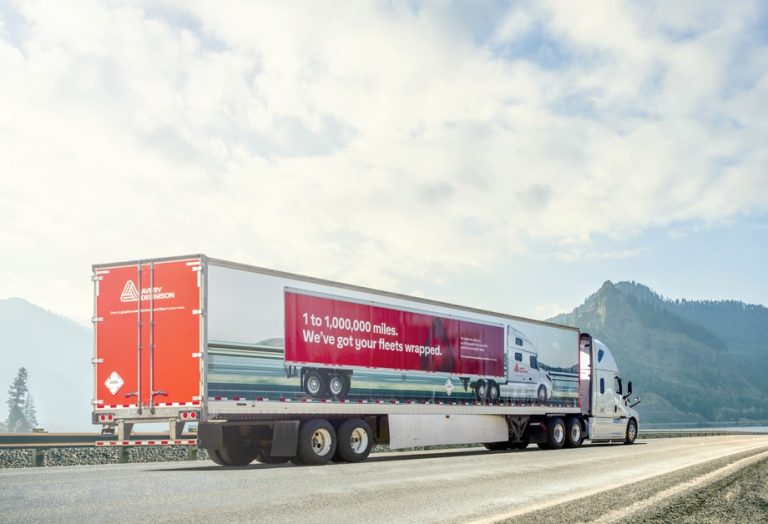
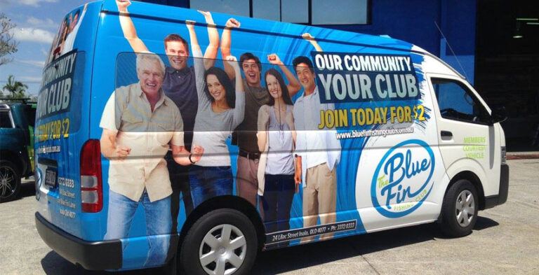
A branded truck or van becomes part of the company’s public identity whenever it arrives at a customer’s site, makes a delivery or parks outside a workplace. Successful commercial vehicle graphics do more than decorate the bodywork. They repeat the same logo, colours and message that customers see on the website, uniforms, invoices and business signage.
The examples below focus on choosing suitable layouts, preparing accurate information and making graphics that work on real commercial vehicles. Each vehicle must be assessed for its physical condition, openings and working environment before production.
A consistent identity builds recognition
When a delivery vehicle pulls into a business park, the company logo is often the first thing people notice. A familiar colour palette and the same typography used elsewhere help customers link the vehicle with the business. Consistency does not require complicated artwork. It requires the same core identity being applied accurately to different surfaces and sizes.
Truck graphics and van graphics serve different viewing patterns
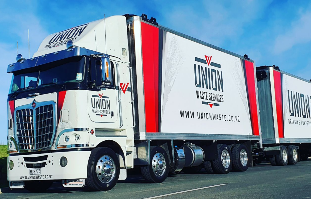
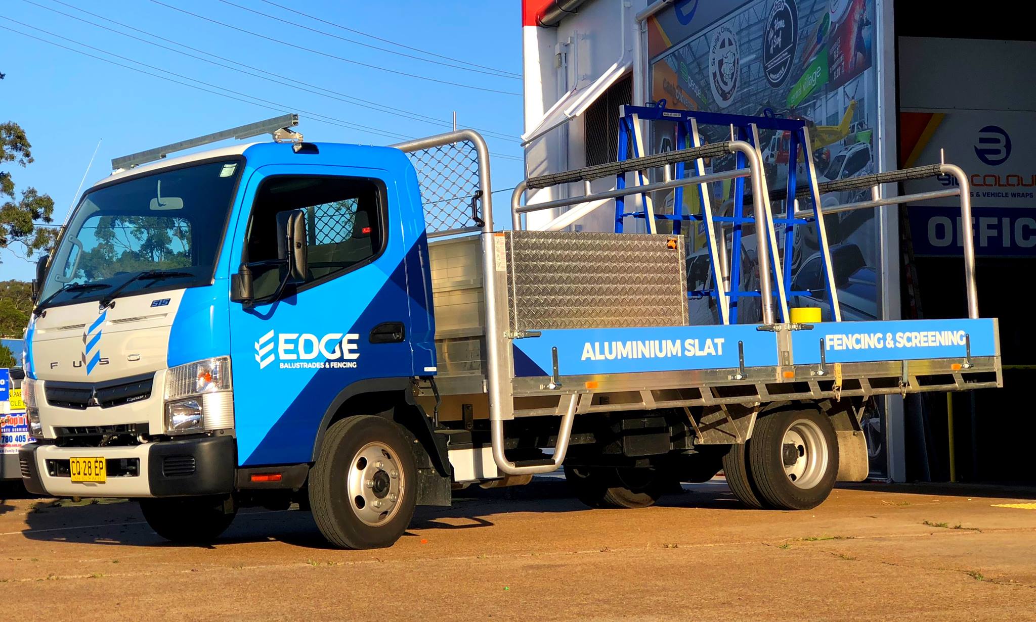
Commercial trucks may present large side panels and tall rear doors to road traffic, while service vans may be seen for hours outside homes and workplaces. Design with those contexts in mind. The important message on a truck may need to be recognised quickly at a distance; the message on a parked van may benefit from a clear trade description. Both should remain readable and consistent.
Plan a simple hierarchy
Start with the logo or company name, then a concise description of what the business does, followed by one contact option where appropriate. A list of every service and every social account usually creates noise. Use enough contrast for lettering to stand apart from the vehicle body. Check proofs from the rear and each side, including with doors open where relevant.
Make different vehicle types feel related
A business might use a small van for local appointments and a larger truck for delivery work. Their graphics do not need to be identical. Maintain the same approved logo, lettering style and core colour blocks while adapting placement and scale. This lets different body types communicate one recognisable brand rather than a collection of separate designs.
Consider the employee and customer experience
Professional-looking graphics support a coherent customer experience when staff arrive in branded vehicles. Clear vehicle identification can help customers know which company is on site, particularly where multiple service providers are working. Keep all business details accurate and make sure vehicle branding does not claim accreditations, service areas or capabilities that the company cannot substantiate.
Fit the design around daily operations
Some vehicles are loaded repeatedly, others have sliding doors, steps or tool racks. A graphic positioned where equipment rubs against it may wear prematurely. The designer should understand normal working conditions and keep text away from moving fittings. Discuss maintenance instructions, film suitability and any constraints created by safety markings before production.
Turn the design into a repeatable specification
Document approved logo dimensions, colour references, the wording of the service line and placement principles. Include vehicle photographs and final artwork files. As new trucks or vans join the operation, this specification helps keep graphics consistent. Fleet branding then becomes an organised extension of the business identity, not a series of unrelated jobs.
Practical project preparation checklist
- Vehicle identification: Record the make, model, body style, year and relevant dimensions.
- Photographs: Photograph the left side, right side and rear, including any working equipment.
- Artwork: Supply an approved business logo, correct company name, brand colours and text.
- Viewing conditions: Decide where the vehicle is usually parked and what is visible in normal use.
- Body limitations: Identify doors, hinges, windows, trim, registration details and safety features.
- Proofing: Check artwork placement, contact details, logo readability and how the graphics appear at reduced size.
Frequently asked questions
Why match vehicle graphics to other business branding?
A consistent logo, colour palette and message help customers recognise the same company across different touchpoints.
Do trucks and vans need exactly the same graphics?
No. Shared brand rules can be adapted to each vehicle’s shape and viewing conditions.
What is important for vehicle readability?
Clear text hierarchy, strong contrast, suitable scale and placement away from body hardware.
How should a mixed fleet be planned?
Start with a shared visual system and then adjust layouts separately for each vehicle model.
Take the next step with a clear vehicle brief
Good branding comes from balancing a strong visual identity with the vehicle’s everyday use. Instead of copying a layout from a different model, provide photographs and discuss the available panels and the main message. A practical design brief gives the project a stronger foundation.
Explore truck branding, related van wrapping and fleet branding, or contact Kayma Signs about your commercial vehicle graphics.
Real-world design scenarios and practical decisions
How graphics support customer arrival expectations
When a technician or delivery driver arrives, customers may look for visual confirmation that the vehicle belongs to the expected business. A recognisable logo and consistent colour palette can help. The design should not depend on the customer reading several lines of small print. Keep the main service category clear enough that the vehicle identifies itself without a lengthy explanation from the driver.
How fleet consistency helps across locations
A business may operate vehicles on different routes or from several work sites. If each one uses a slightly different logo, typeface or phone number format, the company identity becomes fragmented. A short artwork specification helps ensure that the same business name and colour system appear across the fleet. Vehicle proportions can vary, but the identity should remain recognisable whether it appears on a truck cab, van side or rear door.
Why operational details influence brand design
Commercial vehicles are working tools. Loading equipment, roof racks, sliding doors and other fittings can obstruct branding when the vehicle is in use. A strong design acknowledges those features instead of pretending every panel is flat and permanently visible. Ask staff which parts are frequently accessed or cleaned. That information can prevent important graphics from being placed where they are likely to wear or become hidden.
Create a record for future branded vehicles
Save the final approved artwork alongside notes about placement, colours and the vehicle model. Photograph finished vehicles from similar angles and compare the logo hierarchy. This makes it easier to maintain visual consistency if a truck or van is replaced. For a growing company, a clear graphics record is often more useful than starting each new vehicle design from a blank template.