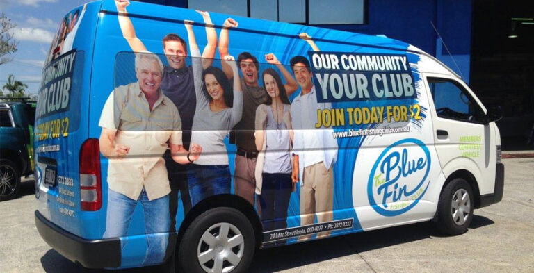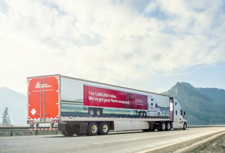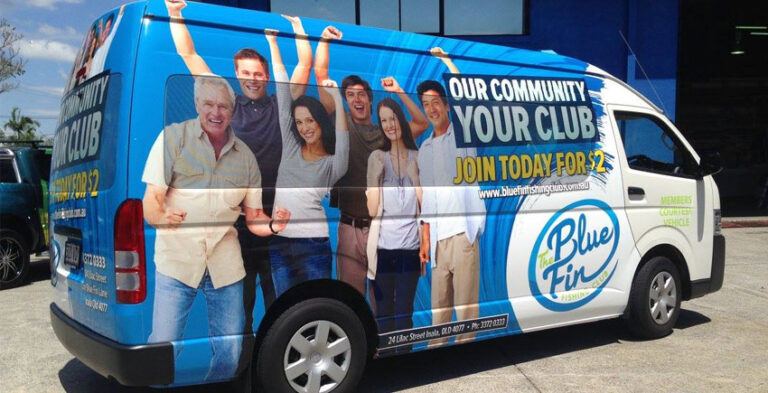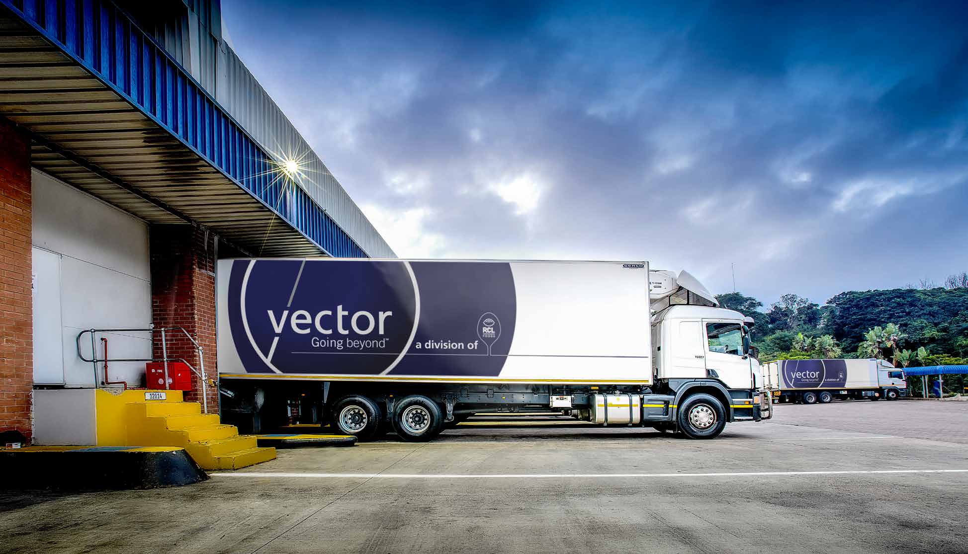
A branded commercial truck is seen in a very different way from a company car. Its large body panels create room for bold graphics, but that space is interrupted by doors, load bodies, equipment and working conditions. The strongest truck branding ideas combine a recognisable business identity with layouts that can be understood on the road and at customer premises.
The examples below focus on choosing suitable layouts, preparing accurate information and making graphics that work on real commercial vehicles. Each vehicle must be assessed for its physical condition, openings and working environment before production.
Put the business identity on the biggest useful surface
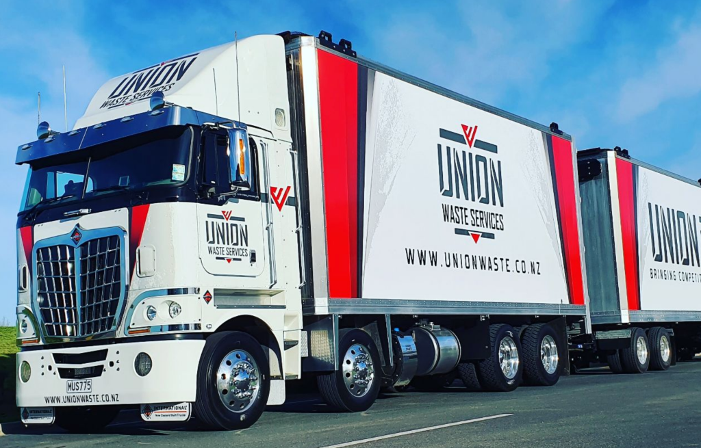
Start by identifying the panels most likely to be seen in the truck’s normal operating environment. A delivery truck’s side body may offer a much larger uninterrupted area than its cab, while a working tipper or service truck has different body dimensions. Position the logo and short service message where they are least likely to be obscured by equipment or doors. A large logo may work better than an elaborate background because recognisability is the first objective.
Give the cab and load body related roles
The cab doors can carry the company name and a concise service description. The load body may carry a larger logo, distinctive colour band or product imagery. These elements should look like parts of one design, not two unrelated signs. Consider how much of the truck’s body is visible when it is loaded or parked. When graphics must be adapted to multiple truck types, keep consistent brand elements but adjust their locations.
Use the rear for a simple recognition cue
The back of a truck can be visible for longer periods in slow traffic. That does not mean it should be crowded with dense text. A large logo, one short service line and a simple contact method are more useful than a paragraph. Leave compulsory identification, lights, reflectors, fittings and moving door parts unobstructed. The installer should assess the actual vehicle and applicable requirements before placing graphics.
Keep artwork away from working hardware
Commercial trucks may have straps, hinges, tail lifts, refrigeration units or access panels. These affect available space and can scratch or conceal graphics. A design proof should mark these physical obstacles. Logos should not be divided by panel joins if a cleaner position is available. When a truck has a curtain-sided or textured body, discuss the appropriate application solution rather than assuming ordinary vehicle film will perform the same way.
Build visibility with deliberate contrast
A truck may be viewed under direct sunlight, street lighting or inside industrial premises. Contrast between the body colour and company lettering makes the branding easier to read. A bold brand colour can connect the cab and trailer visually without filling every available area. Check a mockup at a small scale; a design that only works when enlarged is unlikely to communicate clearly on the road.
Think about multi-truck consistency
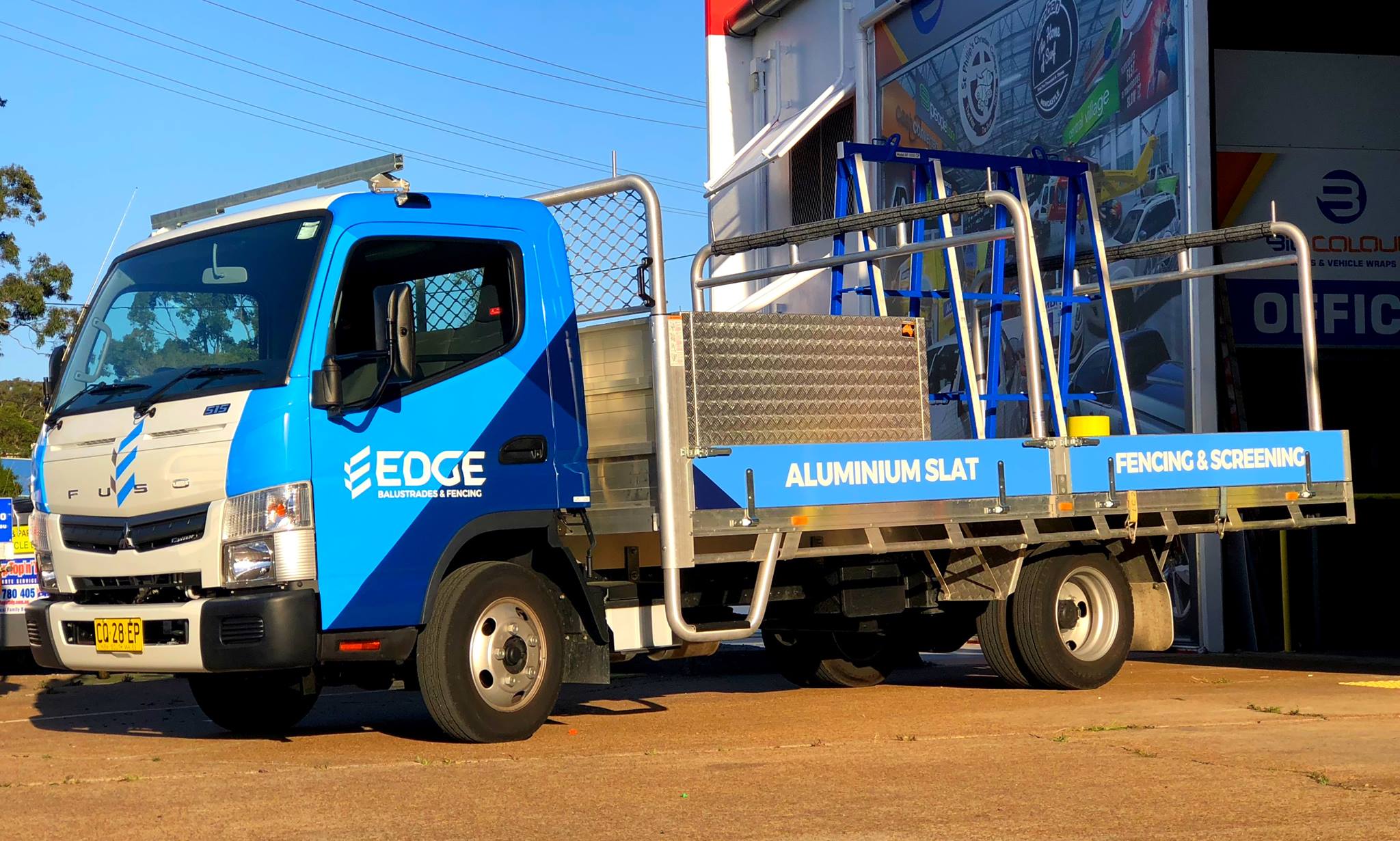
Two trucks with different body styles can still look like the same company’s vehicles. Keep logo artwork, type style, brand colours and key placement principles consistent. For a fleet, maintain a basic graphics specification recording the approved design and any model-specific adjustments. The goal is recognisable identity across different vehicles, not identical placement that ignores actual body dimensions.
Prepare a real installation brief
Gather photographs from each side and the rear, the truck make and body type, approximate usable panel dimensions, accurate brand files and any operational restrictions. Indicate whether graphics must withstand regular loading, cleaning or exposure to equipment. Check the final proof against the real vehicle. This preparation is more useful than selecting a design solely because it looks striking in an unrelated online example.
Practical project preparation checklist
- Vehicle identification: Record the make, model, body style, year and relevant dimensions.
- Photographs: Photograph the left side, right side and rear, including any working equipment.
- Artwork: Supply an approved business logo, correct company name, brand colours and text.
- Viewing conditions: Decide where the vehicle is usually parked and what is visible in normal use.
- Body limitations: Identify doors, hinges, windows, trim, registration details and safety features.
- Proofing: Check artwork placement, contact details, logo readability and how the graphics appear at reduced size.
Frequently asked questions
What type of graphics work on commercial trucks?
Printed panels, vehicle lettering, logos and other suitable commercial graphics may be used, depending on the body material and installation surface.
Can cab and body graphics differ?
They can serve different purposes while using the same logo and colour system to maintain a consistent identity.
What details are needed before truck branding?
Vehicle photographs, body dimensions, artwork, required text and information about doors or working equipment.
Can a mixed truck fleet share branding?
Yes, though graphics should be sized and positioned separately for each body type.
Take the next step with a clear vehicle brief
Good branding comes from balancing a strong visual identity with the vehicle’s everyday use. Instead of copying a layout from a different model, provide photographs and discuss the available panels and the main message. A practical design brief gives the project a stronger foundation.
Explore truck branding, related van wrapping and fleet branding, or contact Kayma Signs about your commercial vehicle graphics.
Real-world design scenarios and practical decisions
A local service truck with cab lettering
A truck carrying equipment to customer sites may use the cab doors for company identification and the body for a larger logo. The business name should remain readable even when the truck is parked close to another vehicle. If a roof rack, crane or lifting mechanism is present, keep the graphics away from areas likely to be blocked or damaged. An accurate photograph of the working truck is more useful than a generic mockup when planning this design.
A distribution truck with a box body
The large, flat side of a box body offers room for a bold design, but it can become overcrowded. A strong company name, one supporting message and a recognizable colour field often communicate more clearly than a collage of products. Consider the rear independently because delivery vehicles may be viewed for longer when stopped at lights or loading bays. Safety markings and access hardware must remain visible and usable.
Branding a small truck alongside larger vehicles
A company operating several trucks may have different body sizes and colours. Instead of scaling the same artwork indiscriminately, agree on a consistent logo, typography and colour system. Adapt the placement so each vehicle has a clear brand cue on its most visible surfaces. Record the final layout for future additions. This is especially helpful for businesses whose trucks are assigned different delivery routes or operate from more than one depot.
Evaluate a truck branding proof
Request left, right and rear views that show equipment, hinges, body joins and unavoidable obstructions. Look at the proofs from a distance and check whether the company name dominates over decorative graphics. Verify contact details and that the service description matches the business’s actual offering. Ask how the application will cope with loading areas, body type and normal maintenance. The final design should make sense as a working vehicle, not just as a marketing illustration.