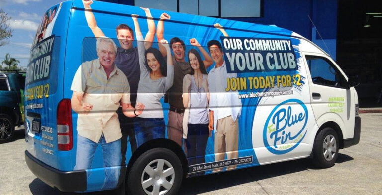
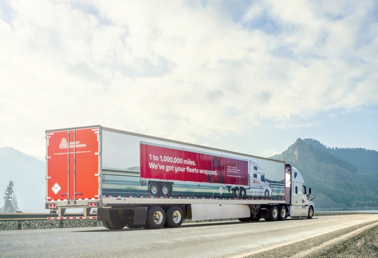
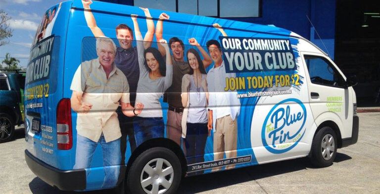
Car branding design works best when it is treated as a practical communication project rather than simply a picture placed on a vehicle. A professionally planned design gives the logo room to breathe, keeps lettering legible and adapts to real vehicle surfaces. These steps help a business prepare a clear brief and evaluate artwork before installation.
This guide focuses on the design workflow from brief and typography to proof and installation. For finished graphics, the design should suit the specific vehicle rather than rely on a one-size-fits-all template. Practical planning matters as much as appearance: messages need to stay readable, the installation surface must be suitable and relevant safety features need to remain unobstructed.
Define the one thing the car must communicate
List what someone should understand after seeing the car briefly. The primary message might be your business name, trade or delivery service. Secondary details can include a website, phone number or short supporting line. Rank these elements before the artwork begins; if everything is equally large, nothing is visually dominant. Avoid trying to reproduce the full contents of a brochure on the doors.
Build a readable typography system
Lettering that looks refined on a laptop may become difficult to read once placed across a curved door or seen from a distance. Choose a clear typeface, enough contrast and sensible spacing. Keep the business name prominent and avoid stacking too many type styles. Test the design at a reduced size and from both side and rear perspectives; the wording should remain understandable without zooming in.

Adapt artwork to the actual car model
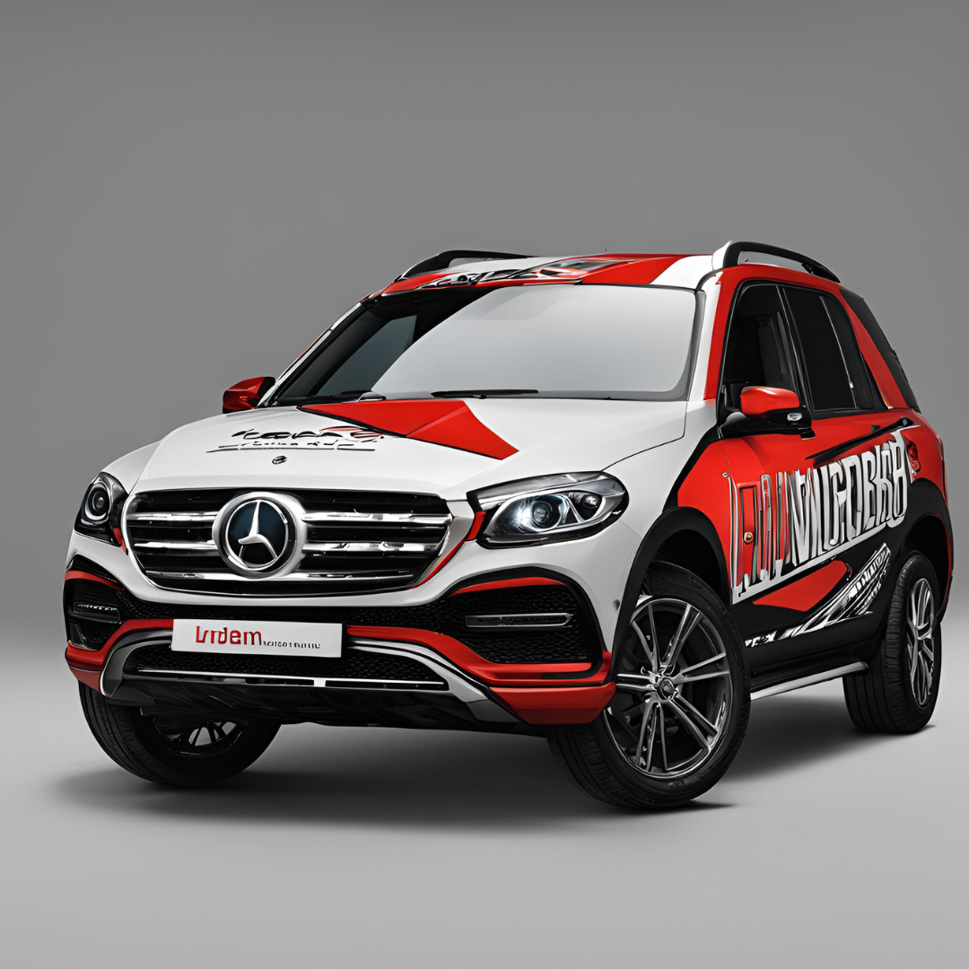
Photographs of the vehicle and model-specific templates help show where the artwork will sit. Door handles, trim, mouldings, mirrors and wheel arches influence graphic placement. A logo can be stretched or clipped if the wrong template is used. Make sure the proof identifies the vehicle model and distinguishes printable panels from windows or surfaces that require special treatment.
Choose images and graphic shapes carefully
A strong geometric shape can create a recognisable brand cue without overwhelming the logo. Photography works when it illustrates the service directly, but detailed scenes may become visually noisy on a moving car. Keep important faces, words and symbols away from joins and curves. Remember that printed colour is affected by material, lighting and the underlying surface, so proofs are guides rather than exact screen-to-road matches.
Check the design from real viewing positions
Look at side and rear mockups at approximately the size another person would perceive them on a road or in a parking area. Cover up any fine print and ask whether the main business identity still makes sense. Check both bright and low-light contrast. If the design depends on a tiny tagline to explain the service, move that idea into a clearer main phrase.
Approve a production-ready brief
Send the designer vector artwork where possible, brand guidelines, photographs and verified contact details. Review spelling, phone numbers and website addresses carefully because mistakes become part of the finished vehicle. Confirm which panels are included and ask for a final placement proof. If more cars will follow, retain the approved layout files so new models can use the same visual system.
Checklist before you approve the artwork
- Identity: Check the company name, vector logo, brand palette and typography for consistency.
- Vehicle: Identify the exact model, body colour, panel condition, door openings and accessories.
- Message: Put the most important service or brand claim first, and keep the wording concise.
- Layout: Review both sides and the rear at a distance as well as close up.
- Practicality: Avoid obscuring vehicle lighting, registration details, driver sightlines and safety features.
- Approval: Confirm spelling, contact details and final artwork placement before installation.
Frequently asked questions
What makes a professional car branding design?
Legible typography, clear hierarchy, accurate logo placement and alignment with the vehicle’s actual bodywork.
What should I provide to a designer?
Brand files, vehicle photographs and model details, accurate text and an explanation of the main audience.
Can one logo design fit all cars?
The logo can remain the same, but its size and position should be adjusted for each vehicle type.
Why is a vehicle mockup important?
It helps reveal conflicts with doors, curves, windows and other details before the graphics are produced.
Putting the design into practice
Make the decision from the way your vehicle is actually used and what a potential customer needs to recognise. Choose clarity over an overcrowded layout, keep the brand consistent with other business materials and review final placement on the real body shape. Kayma Signs can discuss the desired vehicle graphics and the information needed to develop a suitable design.
Explore car branding services, compare related car wraps and send your vehicle details for a project enquiry.
Practical business applications and design decisions
Working with a vector logo
Designers usually obtain a cleaner result when the source logo is available in a suitable vector format because it can be scaled without the same limitations as a small raster screenshot. If you only have a low-resolution logo, mention that early so it can be assessed before production. Ask for approved brand colours and typography too. A vehicle design is a poor place to improvise a new logo variation that customers will not recognise from your website and signage.
A useful example of hierarchy
Consider a company called Greenway Services with a short name and several separate offerings. The car does not need to list every service. A strong composition could make the company name prominent, put ‘Property maintenance’ underneath, and place one contact route in a readable secondary position. This is an illustrative example, not a claim about a real customer. It demonstrates how information can be prioritised before choosing a photograph or graphic background.
Proofing from the perspective of other road users
A design proof should not only be inspected at full size. View a reduced version as if the car were across a road or parked in a busy area. The primary identity should remain visible even when small print disappears. Pay attention to whether the letters become lost over dark windows or reflective body sections. It is also useful to check the rear independently because people often see it from a different distance than the side panels.
Create a repeatable approval record
Once the layout is approved, save the final version with the date, vehicle model, exact contact wording and any special installation instructions. This is useful if the business later adds another car or wants to replace a damaged panel. Do not rely on a screenshot or a casual text message as the only reference. A clear record helps avoid differences in type size, colour or wording between vehicles, especially when branding work is completed in several stages.