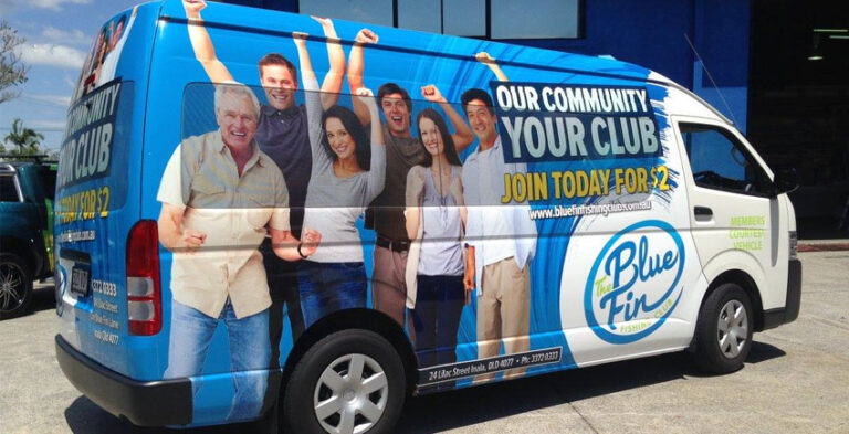
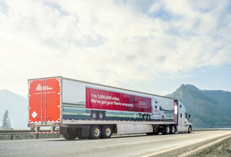
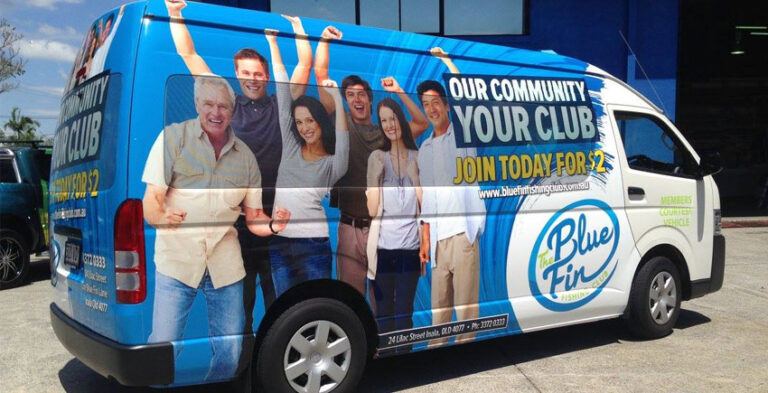
A good company car does not have to be covered from bumper to bumper to be recognisable. The most useful car branding ideas balance a strong identity with text that pedestrians and drivers can understand quickly. Whether the car visits clients, delivers products or serves as an everyday sales vehicle, its design should communicate one clear message.
This guide focuses on a gallery-minded decision guide to visual styles and legible roadside messages. For finished graphics, the design should suit the specific vehicle rather than rely on a one-size-fits-all template. Practical planning matters as much as appearance: messages need to stay readable, the installation surface must be suitable and relevant safety features need to remain unobstructed.
The clean-logo approach
Start with the company logo on the front doors, supported by a short service line and a single clear contact method. This restrained design suits consultants, technicians and businesses that want their vehicle to look professional without visual clutter. The doors offer a consistent viewing position, but every logo needs enough clear space around it. A small logo surrounded by tiny slogans usually performs worse visually than a bold recognisable mark. Review the design on a photograph taken from several metres away before approving the artwork.
Bold side-panel graphics
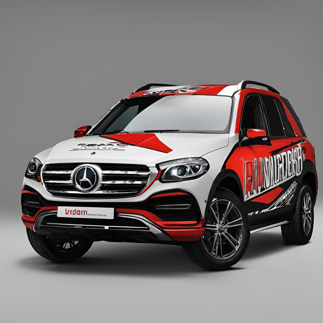
A distinctive diagonal, colour block or printed shape can make a white or silver car look clearly branded. The important detail is hierarchy: the brand should remain the first thing noticed, followed by the service category. A large graphic that competes with the business name may look impressive in a mockup but communicate very little on the street. Use body contours to guide the composition instead of forcing a rectangular poster onto curved doors and wheel arches.

Rear-window and tailgate branding
Rear sections are visible while the car is parked and at traffic stops. They are useful for a short website address or a simple service description, but avoid very small phone numbers, extensive social handles and any graphics that obstruct driver visibility. Windows, lighting and registration plates introduce practical restrictions, so ask the installer to assess the actual vehicle rather than trusting a generic template. Rear-door artwork should also make sense when opened.
The colour-and-contrast method
Choose contrast that survives changing light: a dark logo against a light body, or bright lettering against a dark surface. A complicated photographic background can lower legibility even when it looks attractive on a computer screen. Keep brand colours consistent with uniforms, invoices and shop signage. If multiple cars have different factory paint colours, use a design system with an approved light and dark logo variation so the fleet still looks related.
Branding that matches a specific trade
A cleaning company can emphasise trust and a clear company name; an installer may benefit from an easily understood trade description; a delivery business can prioritise a recognisable identity. Avoid claiming that the vehicle provides services or locations that the company cannot actually support. The strongest layout is the one that helps a potential customer identify the business, understand its role and remember it later.
Turn the idea into a workable design brief
Before printing, gather your logo in a usable vector format if available, clear photographs of each side, the make and model of the car, brand colour references and the one message you want people to remember. Mark any racks, trim, body mouldings and window restrictions. Agree where the logo and contact details will appear before choosing secondary artwork. This turns inspiration into an achievable layout instead of leaving the printer to guess.
Checklist before you approve the artwork
- Identity: Check the company name, vector logo, brand palette and typography for consistency.
- Vehicle: Identify the exact model, body colour, panel condition, door openings and accessories.
- Message: Put the most important service or brand claim first, and keep the wording concise.
- Layout: Review both sides and the rear at a distance as well as close up.
- Practicality: Avoid obscuring vehicle lighting, registration details, driver sightlines and safety features.
- Approval: Confirm spelling, contact details and final artwork placement before installation.
Frequently asked questions
Is simple car branding effective?
Simple layouts can be highly recognisable when the business name, logo and service are easy to read. The best approach depends on the vehicle colour, use and brand identity.
Can the same artwork fit different cars?
The overall identity can stay consistent, but graphic scale and placement need adjustment for doors, windows and body proportions.
Should contact details appear on every panel?
No. Use a clear contact method in a place people can read; unnecessary repetition can make the design feel crowded.
What files help with a car branding design?
A vector logo, brand colours, vehicle photographs and a brief description of the intended message are useful starting points.
Putting the design into practice
Make the decision from the way your vehicle is actually used and what a potential customer needs to recognise. Choose clarity over an overcrowded layout, keep the brand consistent with other business materials and review final placement on the real body shape. Kayma Signs can discuss the desired vehicle graphics and the information needed to develop a suitable design.
Explore car branding services, compare related car wraps and send your vehicle details for a project enquiry.
Practical business applications and design decisions
A service-business car seen at a customer site
Imagine a maintenance company arriving at a residential property. The car may be parked for an hour or more, giving neighbours time to recognise the brand. That scenario benefits from a clear company name on the door, a short description of the trade, and a simple contact route. Detailed product photography is not essential. Consider whether the vehicle is viewed primarily from the pavement or the road, and position the strongest graphic accordingly. The design should still look professional when the car is dirty or partly shaded.
A delivery car used for frequent stops
A small delivery vehicle may be seen from the rear more often than from the side. Its owner might prioritise a memorable logo on the tailgate and consistent door graphics so customers can identify the vehicle arriving at a business premises. Keep the lettering away from registration details, lights and moving mechanisms. If the rear contains complex curves or a glass panel, avoid stretching a long phrase across surfaces that interrupt the wording.
A professional car with understated branding
Consultancies and specialist service providers sometimes want an elegant identity rather than a loud full-body composition. A single colour logo, controlled typography and a clean rear mark can create a distinctive result. The key is restraint with purpose, not an almost invisible logo. Test the graphic on the actual paint colour and look at it in both sunlight and shade. The logo should be easy to recognise without depending on decorative shapes.
Choosing among the ideas
Make a short comparison sheet using three actual vehicle photographs: one minimal-logo layout, one partial graphic treatment and one colour-led layout. Ask which proposal makes the business name easiest to recognise at a glance. Then check the readability of contact details, whether important artwork crosses door joins and whether the design could be adapted to another vehicle in the future. Approve a style because it serves the business identity, not solely because it looks impressive enlarged on a screen.