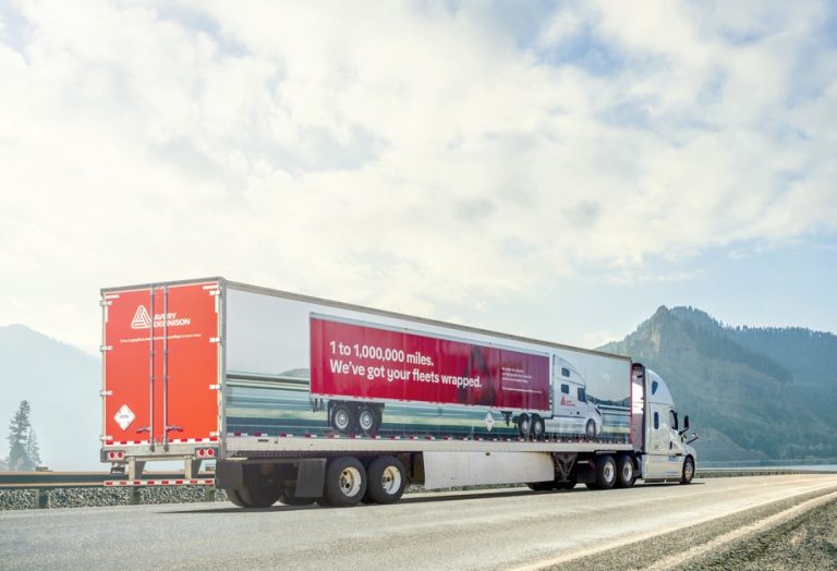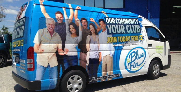
Modern vehicle branding is less about filling every surface and more about creating a memorable business identity that works on a moving car, van, bakkie or truck. Strong typography, carefully selected colours and practical vinyl applications can make even a restrained design recognisable. The best approach starts with what customers need to notice and how the vehicle is used.
The following applications are design approaches rather than claims about a single fashionable style. Choose the ones that reflect your brand and the real vehicle, then confirm the final material and placement with the installer.
1. Make the business identity the main visual
Start with the company name and logo, then decide which other element genuinely helps people understand the service. A vehicle in traffic is not a brochure: viewers see it briefly and from changing angles. The identity needs to remain clear without depending on a tiny slogan. Strong designs use scale and spacing deliberately so the logo is readable against the bodywork. A powerful layout can be simple, with one dominant shape and a short contact method placed where it can be read.
2. Use graphic shapes instead of crowded imagery
Large colour panels, flowing stripes and geometric accents can create a recognisable look without competing with the business name. The shape might follow a body contour or connect the side and rear designs visually. Avoid adding abstract decoration merely to use up empty space. Every graphic should support the company identity. When a photographic image is used, check that it stays readable on curved surfaces and does not put an important subject across door seams.
3. Create contrast around logos and text
A white van and a dark-coloured car cannot always use the same logo treatment. An approved light and dark version of the company identity can preserve consistency without sacrificing legibility. Look at the actual body colour in daylight. Ensure the logo contrasts sufficiently with its background and does not become lost in a photograph or gradient. A short service line can be positioned beneath the logo, but it should remain secondary.
4. Combine vinyl lettering with larger graphic areas
Modern vehicle graphics can use separate cut lettering for the company name and printed vinyl for colour fields or supporting imagery. This lets the design mix crisp text with broader visual treatment. It also provides flexibility when adapting branding to vehicles of different sizes. The important point is to approve the artwork as one coherent layout, so separate pieces do not look misaligned after installation. The printing and application methods should suit each particular vehicle surface.
5. Design the rear as a separate communication space
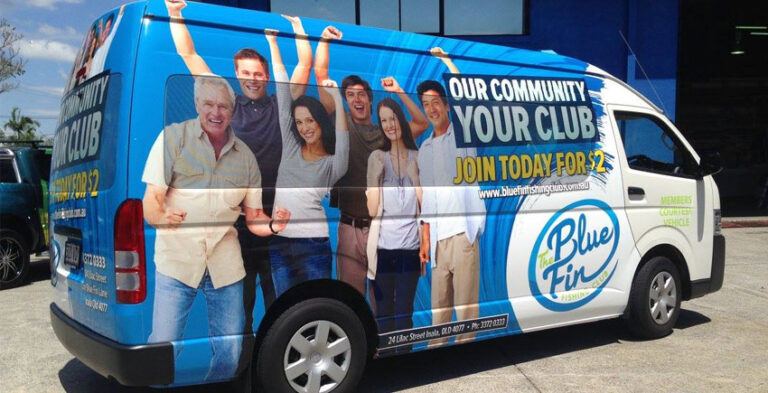
The back of a car or van has different proportions from the side. Rear-door hinges, handles, lights and registration areas constrain design placement. A compact logo, short service descriptor and clear contact route can be more useful than shrinking the whole side layout to fit. Rear graphics should also make sense when the vehicle is parked. Do not obstruct essential sightlines, safety markings or required vehicle features.
6. Use full and partial wrapping deliberately
A full wrap can carry a connected composition across most suitable exterior panels. A partial wrap can concentrate the same brand identity on the side doors, rear quarters or another visible area. Neither method should be chosen just because it uses more or less material. Make the decision based on the desired visual effect, body colour and available surfaces. Compare car wraps and car branding to understand the distinction.
7. Adapt designs for delivery and trade vehicles
Delivery vans often present broad side panels at customer premises, while service bakkies may carry racks, canopies and work equipment. A stylish design must fit those physical constraints. On a tradesperson’s van, a clearly displayed service name can be useful alongside the business logo. On a delivery vehicle, consistent colours can help recognition at collection and drop-off locations. Consider what remains visible when the doors are open or equipment is attached.
8. Keep fleet identity flexible across vehicle sizes
A company operating cars, vans and trucks should maintain the same logo, core colours and typography across the fleet. The artwork need not occupy identical positions on every vehicle. Use placement rules rather than one fixed template. A small car might carry the logo on its doors, while a large commercial truck may need a prominent treatment on its load body. Learn more about fleet branding to plan coordinated designs.
9. Check colour and material expectations
Colours on a phone screen may not match printed material exactly. Film finish, printing process, ambient light and the vehicle’s surface all affect appearance. Request an appropriate proof and confirm available materials before final approval. Some materials require particular care or installation conditions; choose them according to the intended use rather than a visual trend alone. Do not rely on an unsupported promise that all wraps last the same amount of time.
10. Plan artwork around the actual vehicle
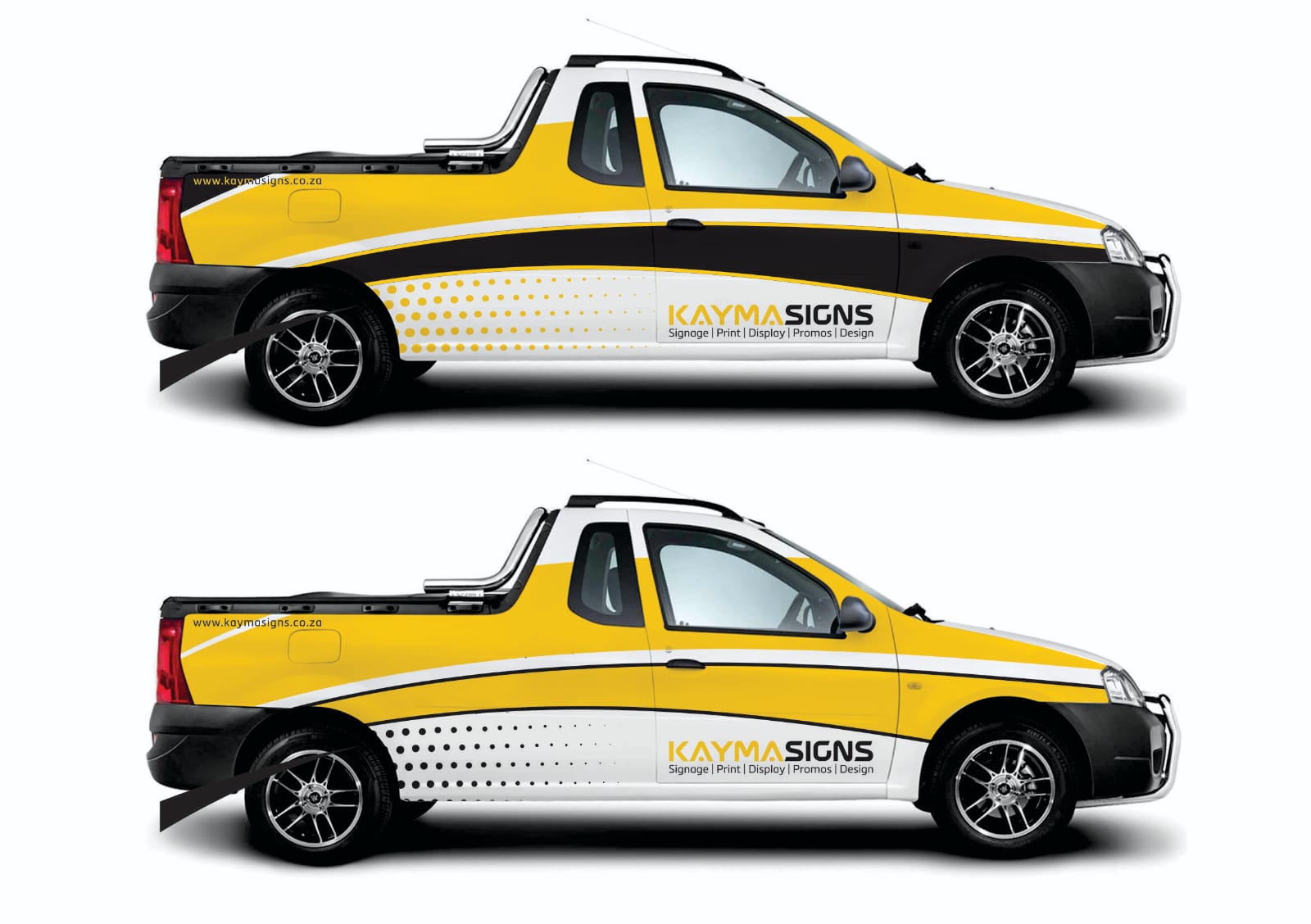
Every vehicle has a different set of doors, mirrors, window lines, curves and trim. Use photographs and accurate model information before drawing the final graphics. Position key wording away from joins and awkward recesses. For trucks, check body equipment and loading hardware. For vans, allow for sliding doors and rear openings. For cars, watch the wheel arches and door curves. A convincing design mockup should reflect the vehicle that will actually be branded.
11. Give the design room to breathe
Not every available panel needs artwork. Unused surface can make a logo more prominent, create visual balance and improve readability. If a design includes a large image, give the business name a clear, uncluttered area. Consider the composition from a distance. View the vehicle as a complete object rather than treating each panel as a separate poster. A smaller number of strong elements often makes a more cohesive company identity.
12. Prepare a design brief that can be reused
Collect brand guidelines, vector logo files if available, exact company wording, accurate contact details, vehicle photographs and a list of design priorities. Approve side and rear views and keep the final artwork. If you later add another vehicle, a documented system makes it easier to maintain consistent branding. For Johannesburg-area vehicles, provide the location and practical access details when discussing arrangements with Kayma Signs.
A Practical Vehicle Graphics Approval Checklist
- Confirm the official company name, vector logo where available, colours and typefaces.
- Check that the main business message is visible at a reduced viewing size.
- Review both sides and the rear of the actual vehicle model.
- Identify doors, handles, windows, loading fittings and other limitations.
- Check website addresses, phone numbers and spelling before artwork approval.
- Confirm which surface receives printed vinyl, cut lettering or another approved treatment.
- Keep the approved layout file for future fleet vehicles and replacement panels.
Frequently Asked Questions
What makes vehicle branding look modern?
Clear typography, carefully chosen graphics, strong contrast and a recognisable brand identity usually matter more than decorative complexity.
Can vinyl lettering and printed wraps be combined?
Yes. Separate lettering and larger printed areas can be designed as one coordinated application.
Can the same branding work on cars, vans and trucks?
The visual identity can stay the same, but the artwork must be scaled and arranged to suit each vehicle’s bodywork.
What should a business prepare before branding a vehicle?
Vehicle make and model, photographs, accurate wording, logo artwork, colour references and the main message customers need to recognise.
Build a Vehicle Design That People Recognise
A well-planned branded vehicle should communicate quickly and remain practical for everyday business use. Choose colour and graphic treatments that complement the vehicle rather than overwhelm its shape, and let the company’s identity lead. Explore Kayma Signs’ vehicle branding services or send your project details to discuss suitable graphics.