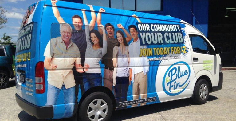
Vehicle branding can look impressive in an enlarged design file yet be difficult to recognise on the road. Common problems include overcrowded text, weak colour contrast, misplaced logos and artwork that ignores body seams. Knowing what to avoid helps a business approve graphics that communicate clearly in real conditions.
For a useful result, match the graphic design to the vehicle’s actual bodywork and the way the vehicle is seen in daily business. The planning steps below help you evaluate options and prepare a clear installation brief.
Mistake 1: treating a vehicle like a brochure
A vehicle is seen from changing distances and angles, so long service lists are rarely useful. A person passing the car should first recognise the company name and what it does. Use a concise phrase rather than a paragraph. Keep additional information on your website, proposal materials or office signage. Ask whether the brand remains identifiable if the viewer sees it for only a few seconds.
Mistake 2: making the logo too small
A tiny logo surrounded by large patterns or photographs gives visual priority to decoration rather than identity. Decide on a clear primary focal point. The logo or company name should generally be dominant on at least the main viewing side. A secondary design element can support recognition but should not compete with it. Test the layout on an actual vehicle photograph and reduce the proof to see what survives.
Mistake 3: weak contrast against the paint colour
Light lettering on a silver body or dark lettering on a dark vehicle may disappear in ordinary daylight. Stronger contrast can make the message readable without needing additional decoration. The printed material may look different under changing lighting, so review colour choices with the actual vehicle colour in mind. Preserve brand identity while allowing an approved light or dark logo variation where useful.
Mistake 4: ignoring doors and awkward body lines
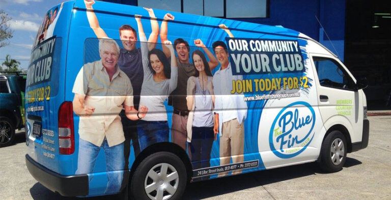
On a van, a sliding door can cut across a headline. On a car, a wheel arch may distort a graphic. On a truck, loading hardware can block lettering. Position important words on flatter, visible sections. A vehicle-specific proof helps avoid artwork that breaks when doors move or appears misaligned because the template does not match the real model.
Mistake 5: adding too many contact details
Several numbers, an email address, a long URL, multiple social accounts and a QR code may create visual clutter. Choose one clear contact route and make it legible. A website address can work if it is short enough; a phone number can work when the layout gives it enough space. Do not assume a passing driver can or should scan a QR code. Keep the design useful and safe.
Mistake 6: missing basic proofing
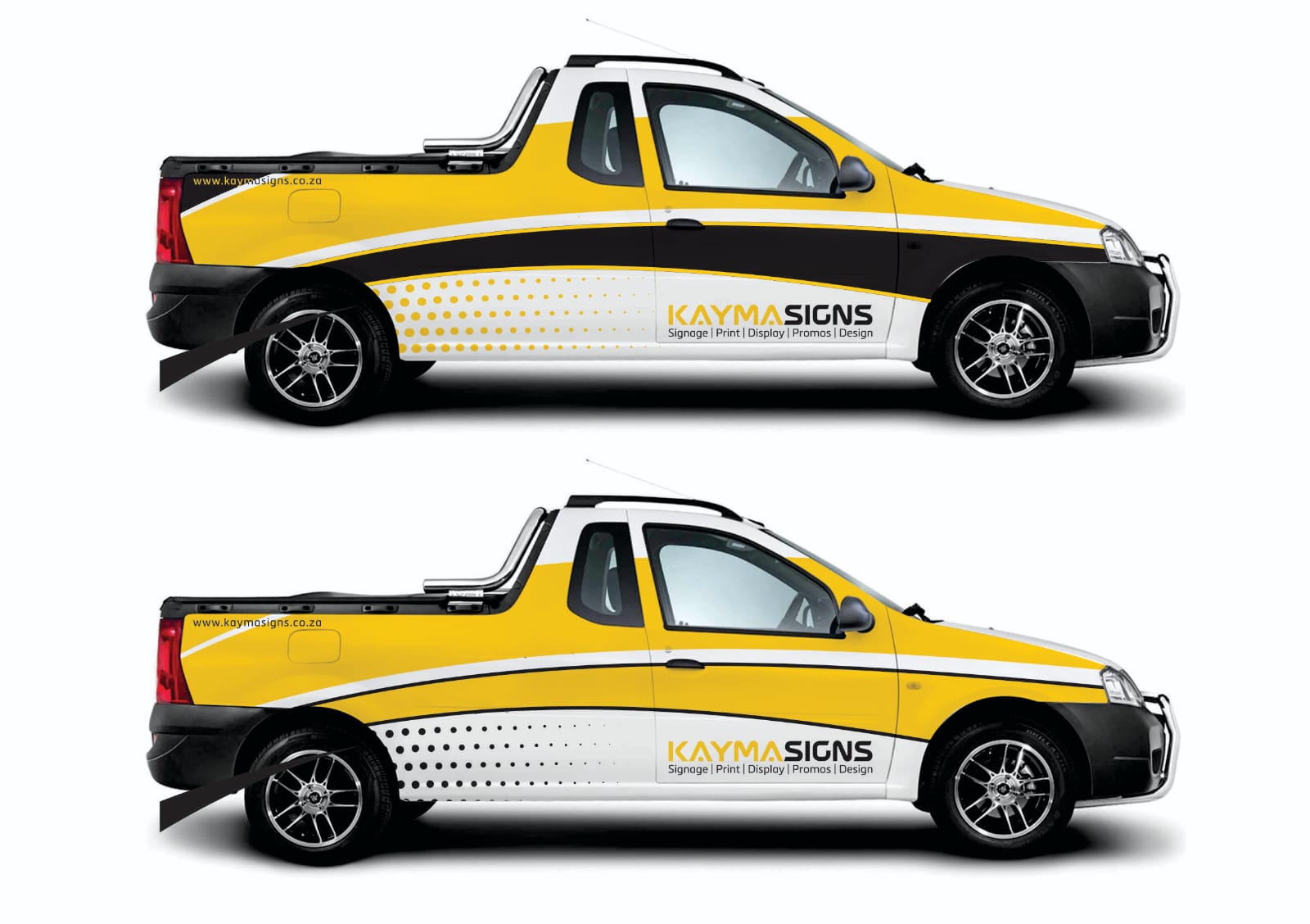
Spelling mistakes and incorrect numbers are especially disruptive once graphics are applied. Verify the approved company name, phone number and branding files before production. Compare the final artwork with the original brand guide and the actual vehicle photographs. Include both sides and rear in the final proof. A last review is easier than trying to correct printed graphics after installation.
Mistake 7: using one unmodified layout for every vehicle
A company may have multiple cars, vans and trucks. Applying identical-size graphics to very different bodies can create inconsistent results. Keep the same logo and brand system while adapting placement to each surface. Standardise important details, not the precise location of every element. This helps a fleet remain coherent without sacrificing readability.
Practical artwork and vehicle checklist
- Vehicle details: Confirm the make, model, type and approximate surface dimensions.
- Brand files: Gather the approved logo, typography, colours and exact wording.
- Working conditions: Identify where the vehicle is normally parked, driven and loaded.
- Layout: Review both sides and the rear, including door movements and body fittings.
- Readability: Test the company name and service message at reduced viewing size.
- Final proof: Check all wording, registration visibility and other safety features before approval.
Frequently asked questions
What is the biggest vehicle branding mistake?
Overcrowding the layout with too much text often makes the business identity hard to recognise.
Should a branded vehicle display every company service?
Usually not. A short description and a clear main message are easier to understand.
Why do vehicle model details matter?
Body dimensions and door locations determine where graphics remain legible and practical.
What should I check before artwork approval?
Spelling, contact details, logo scale, contrast, all viewing angles and safety features.
Bring the branding brief together
Professional vehicle graphics should be easy to recognise, visually consistent and practical for the vehicle’s normal duties. Give the designer accurate photographs and brand materials, then confirm each graphic’s placement on the actual bodywork. A clear brief keeps attention on the most useful design decisions.
Explore vehicle branding services, compare car branding, van wraps and truck branding, or send the vehicle details to Kayma Signs.
Real-world design scenarios and practical decisions
An example of weak branding hierarchy
Consider a vehicle with a large abstract pattern, a tiny company name and several lines of promotional text. People may remember the colour but never identify the business. A better approach would make the logo clear and reduce the supporting message to a brief service description. Decorative elements can remain, but they should frame rather than compete with the identity. Test whether an unfamiliar viewer can understand the business in a glance.
An example of poor panel placement
Imagine a van graphic whose main headline crosses a sliding door opening. It may look correct when the van is closed but break apart or disappear when loading takes place. Moving important text to a separate clear panel can solve the problem. The same principle applies to truck loading bodies, car wheel arches and rear-door hinges. Work from the actual vehicle rather than a generic silhouette.
An example of unnecessary contact clutter
A car design may try to display a phone number, long website, full street address, email, social handles and a QR code. The result can be hard to read and visually unbalanced. Choose the most useful contact route, present it clearly and allow the brand name to remain dominant. If customers need full service details, the website can provide them. A vehicle should direct attention, not attempt to replace every other marketing material.
A practical final review before application
Have someone check the artwork independently for spelling, accurate contact details and consistency with the official company identity. Inspect left, right and rear views at reduced size, then check what happens when doors open. Confirm that important fittings and safety features remain unobstructed. Record any approved changes and keep a copy of the production file. This disciplined final review helps prevent avoidable errors.