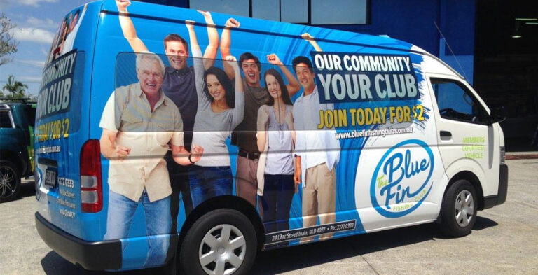
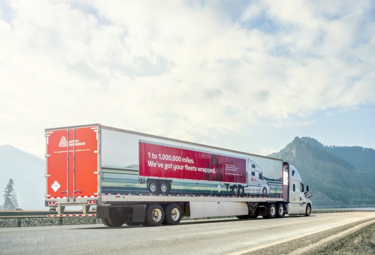
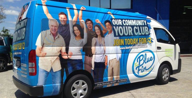
A delivery van can do more than carry tools, parcels or supplies. It can also communicate who you are, what you do and how customers can recognise your business. The most effective van branding ideas balance bold design with everyday practicality: a memorable logo, readable wording, clear brand colours and graphics that suit the vehicle’s shape.
Whether you operate a single tradesperson’s van or a delivery team, the design must work when the van is parked outside a customer’s property, passing through a neighbourhood or standing in traffic. Below are practical ideas for making commercial van graphics useful, attractive and consistent.
1. Make the sides of the van your main message
The large side panels are often the easiest surfaces for nearby drivers, pedestrians and customers to see. Lead with your logo or business name, followed by a short description of your service. If you provide electrical work, for example, a clear line such as “Electrical installations and maintenance” tells people more than a long list of unrelated services.
Keep the important message away from door handles, panel joins and heavily curved areas. A design that looks excellent on a flat screen can become difficult to read once applied across sliding doors and body seams. Ask the designer to work from the actual van model and photographs.
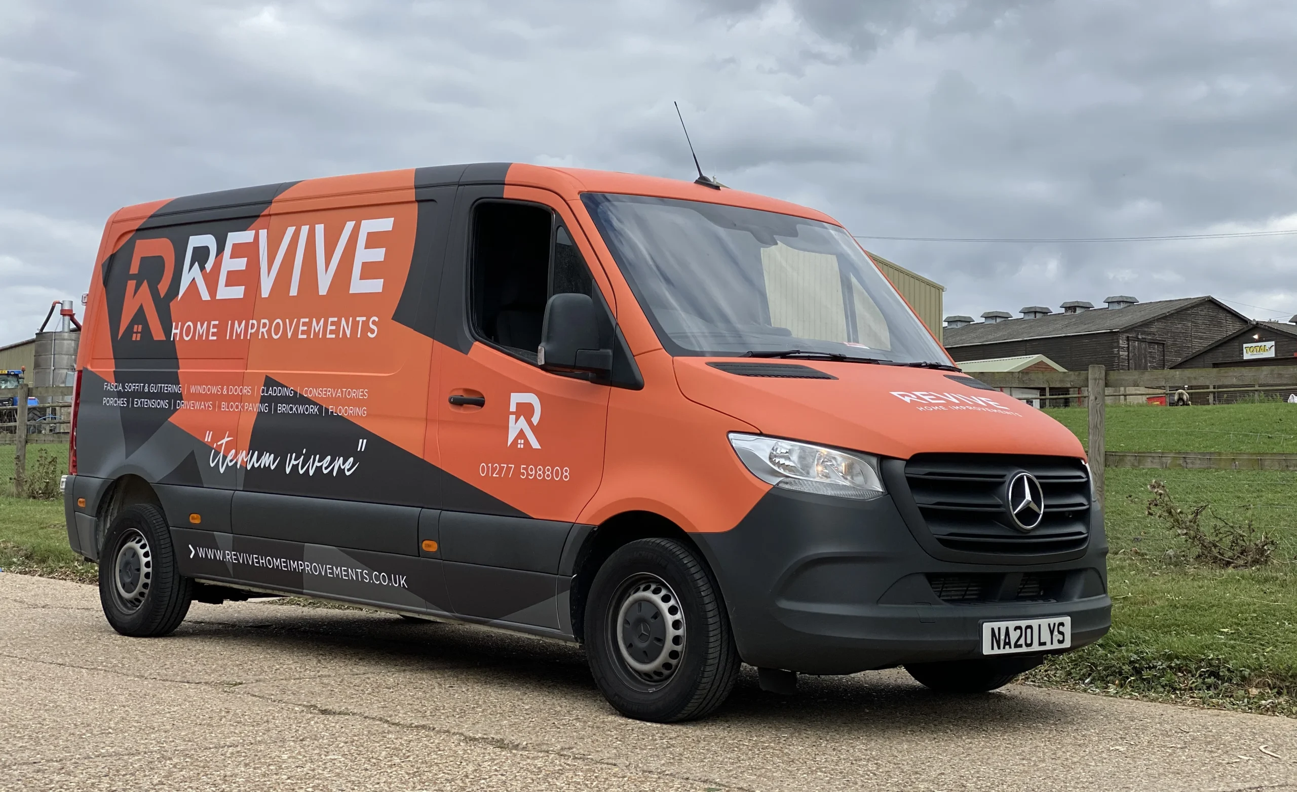
2. Use rear doors for a clear, compact message
Rear branding reaches people who spend time behind your vehicle in queues or at traffic lights. Use this space for the company name, one short service description and a simple contact method. Avoid filling both doors with paragraphs or very small text. The space also needs to accommodate hinges, handles, number plates, lighting and other features that must remain unobstructed.
For delivery businesses, a short branded message helps customers recognise the vehicle approaching their premises. For service businesses, a recognisable company logo reinforces trust before the driver steps out.
3. Match the van graphics to your trade
A generic wrap can look attractive, but a design that immediately explains your service is more useful. Different industries benefit from different visual priorities:
- Plumbers and electricians: Business name, trade description and a highly readable contact method.
- Cleaning services: Clear logo, recognisable colours and a concise description such as commercial or residential cleaning.
- Delivery companies: A consistent logo and vehicle appearance that customers can identify at pickup and drop-off points.
- Landscapers and maintenance teams: Strong contrast, a simple service statement and a design that remains legible when the vehicle is dirty.
- Installation contractors: A professional, restrained look that complements branded uniforms and site signage.
These are design approaches, not one-size-fits-all templates. Choose the few details that make your business understandable at a glance.
4. Consider full wraps, partial wraps and vinyl lettering
Commercial vans offer several branding approaches. A full van wrap creates a connected visual design across much of the exterior. A partial wrap can concentrate graphics on the side panels and rear doors. Vinyl lettering and decals can identify the business with a simpler arrangement of logos and contact details.
For a distinctive illustrated theme, a broader wrap may suit the brand. For a straightforward professional service, lettering and strategically placed panels may be clearer. Before deciding, consider the vehicle colour, amount of visual information needed and whether the branding must match other vehicles.
See Kayma Signs’ van wrapping services for full and partial vehicle-graphics options, and vehicle branding for other commercial vehicle types.
5. Use colour contrast to make the brand memorable
Van graphics should work from a distance, not only in close-up photographs. If the vehicle is white, dark lettering or bold colour panels can help the brand stand out. If the vehicle body is dark, light lettering can improve recognition. Avoid placing thin text on busy photographic backgrounds; the vehicle’s movement makes intricate details harder to read.
Keep logo colours, typography and visual elements consistent with your website, uniforms, packaging and business signage. Consistency helps people recognise the same company across different encounters.
6. Design for sliding doors, windows and body contours
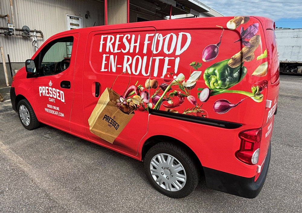
Van doors and window panels change the way artwork is applied. A large illustration may be split when a sliding door opens. A logo across a join may not align when the door is in motion. Window graphics can also raise visibility or legal questions depending on where they are installed. Plan the artwork around the vehicle’s actual openings, sightlines and safety features rather than treating its sides as uninterrupted rectangles.
Provide photographs of both sides and the rear of the van. Include the make, model and year where possible. This makes it easier to adapt graphics to the real body rather than relying on an approximate illustration.
7. Create recognisable delivery-van branding
For delivery companies, visual consistency is especially valuable. A customer should be able to recognise your branded van whether it is arriving at an office, collecting a package or waiting outside a shop. Use the same company name, logo position and colour palette across delivery vehicles. A short web address can be useful if it remains legible; complex URLs and long lists of social handles usually create clutter.
When several vans have different body shapes, create a flexible branding system rather than copying identical graphics at identical sizes. The logo should feel consistent even when it needs a different position on a smaller van.
8. Make tradespeople’s vans look professional at job sites
A van may remain parked outside a customer’s home or business for hours. Its appearance becomes part of the experience of dealing with your company. Clean typography, a clear service description and consistent colours can help reinforce a professional identity.
For tradespeople who carry tools and visit multiple properties, consider how the graphics will look alongside roof racks, ladders, security fittings and other equipment. Branding should not obscure lights, mirrors, registration details or other safety-related features.
9. Keep the same visual identity across a growing fleet
When you add a second or third van, a shared design guide helps new vehicles look related to the first. Record approved logo variations, colours, typography and general placement rules. Different models can use adapted layouts while retaining the same recognisable visual system.
For a combination of vans, bakkies, cars and trucks, fleet branding services can help bring the vehicles together under a consistent business identity.
10. Prepare the right information before designing your van
A useful design brief helps avoid unnecessary back-and-forth. Gather the following before discussing an artwork layout:
- Your business name, current logo and brand colours.
- The van’s make, model, year and photographs of each side and the rear.
- The main service or message that customers should remember.
- The contact method you want displayed and the way it should be written.
- Whether you prefer a full wrap, partial wrap or lettering.
- Any constraints caused by windows, racks, sliding doors or body fittings.
- Your operating area, so practical installation arrangements can be discussed.
Good artwork starts with a clear brief. Even a small logo and lettering design benefits from accurate dimensions and brand files.
Common Questions About Van Branding
What is the difference between van branding and van wrapping?
Van branding is the broader process of putting a business identity on a van. Van wrapping is one technique used to apply printed or coloured vinyl over selected vehicle surfaces. Branding can also include individual decals and lettering.
What should a delivery van display?
Usually a recognisable company name or logo, a concise service description and a simple contact method. The design should remain legible from a reasonable distance and not obstruct vehicle safety features.
Can the same design work on a fleet of different vans?
Yes. Brand colours, typography and logo placement principles can stay consistent, but artwork dimensions and positioning should be adapted to each model.
Can van graphics be used around Johannesburg and Gauteng?
Businesses operating in Johannesburg and surrounding Gauteng areas can discuss their vehicle location and installation requirements with Kayma Signs to confirm practical arrangements for their project.
Turn Your Van into a Recognisable Business Vehicle
The best van branding idea is one that communicates your identity quickly and works with the vehicle you actually drive. Whether the result is simple lettering, a bold partial wrap or a coordinated design for several vans, clarity and consistency should lead the process.
Explore Kayma Signs’ Van Wraps service or send your vehicle details and artwork for a tailored project enquiry.